Checkout Components
Add custom banners, fields, and UI components directly into the checkout flow. Click on any of the components below to see its configuration steps.
Getting Started: Create a Component
- Open the SmartFlow Checkout app in your Shopify Admin.
- Navigate to the Checkout Extensions tab.
- Click on Create and select your preferred component from the available options below.
Available Components Configuration
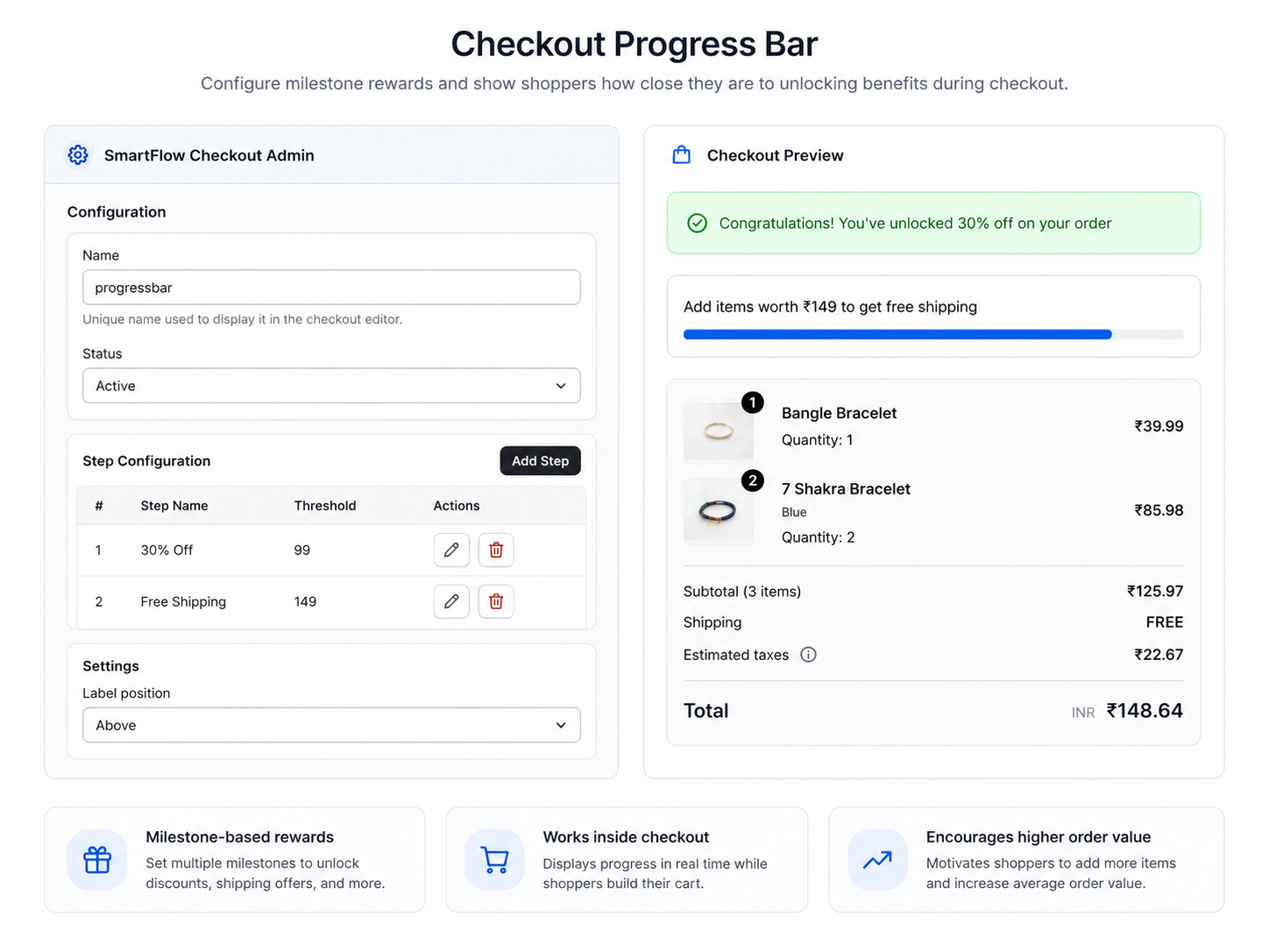
1. Progress Bar
Step 1: Configure Basic Details
- Enter a Progress Bar Name. (Important: You will need to enter this exact name later in the checkout editor to display this specific progress bar).
- Set the Status to Active or Draft.
- Optionally, use the calendar icon to schedule a Start and End Date/Time for automatic activation.
Step 2: Add a Progress Bar Step
- Click Add Step.
- Enter values for all 4 inputs:
- Step Name: Name of the step.
- Step Threshold: Minimum order value to unlock the step.
- Step Progress Message: Message shown while progressing.
- Step Success Message: Message shown when the step is unlocked.
- Click Save to add the step.
- You can add multiple steps with different thresholds.
Step 3: Open Checkout Editor
- Navigate to Settings → Checkout to open the checkout editor.
Step 4: Add the Progress Bar Block
- Click Add block and select Checkout Progress Bar from the list.
- Pick the progress bar you added from the sidebar dropdown.
- Enter the exact unique progress bar name you created in Step 1.
- You can create multiple progress bars and show any of them just by entering its unique name here!
- The selected progress bar will instantly load inside the editor.
Step 5: Save and Verify
- Click Save in the editor.
- Check your checkout page to ensure the progress bar displays correctly.
2. Product Upsell
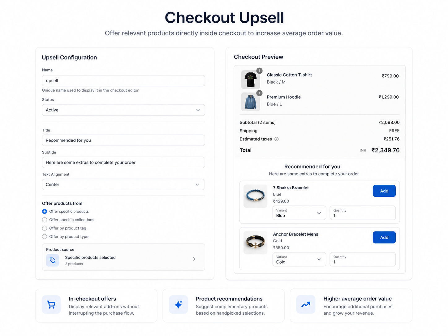
Step 1: Basic Configuration
- Enter a unique Name. (Important: You will enter this exact name later in the checkout editor to display this upsell).
- Set the Status to Active or Draft.
- Optionally, use the calendar to Select Date and Time for automatic scheduling.
Step 2: Headings & Text
- Enter a Title (e.g., "Recommended for you").
- Enter a Subtitle (e.g., "Here are some extras to complete your order").
- Choose the Text Alignment (e.g., Center).
Step 3: Choose Your Offer Type
- Select how you want to recommend items: Specific Products, Collections, Product Tag, or Product Type.
- Select the actual products/collections you want to display in the upsell box.
Step 4: Layout & Product Settings
- Layout Settings: Choose a Layout (Horizontal/Vertical), set the Max total products to show, pick a View Mode (like Slider), and choose a Button style.
- Product Settings: Use toggles to configure the shopping experience:
- Allow Editing Product Variant
- Show product price
- Allow Editing Product Quantity
- Allow customer to redirect to main product page when clicking the image/title
Step 5: Display Conditions
- Choose No Conditions to always show the upsell.
- Or, choose Display by conditions to restrict it (e.g., only show if cart contains a specific item).
- Click Save to store your upsell configuration.
Step 6: Open Checkout Editor & Add Block
- Navigate to Settings → Checkout to open the checkout editor.
- Click Add block and select Product Upsell.
- Enter the exact unique Name you created in Step 1. The selected upsell will instantly load.
Step 7: Save and Preview
- Click Save in the checkout editor.
- Preview checkout to confirm your upsell products are displayed correctly.
3. Custom Fields
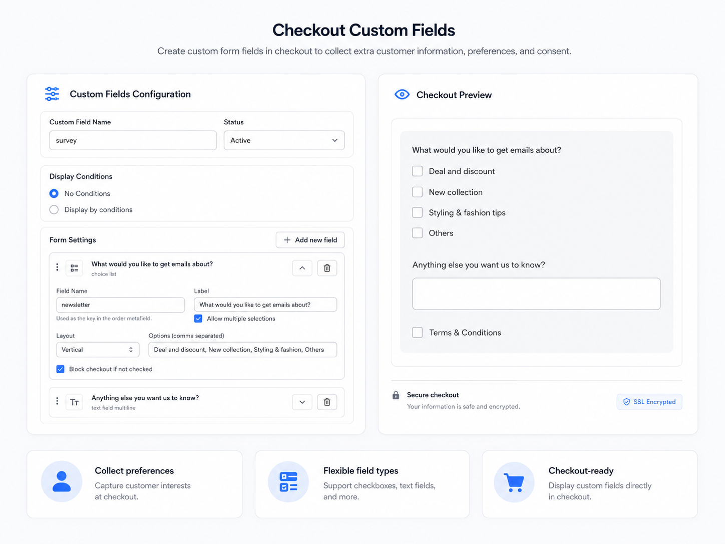
Step 1: Basic Configuration
- Enter a unique Form Name. (Important: You will enter this exact name later in the checkout editor to display this specific form).
- Set the Status to Active or Draft.
- Optionally, use the calendar to schedule a Start and End Date/Time for automatic activation.
Step 2: Create Your Form Fields
- Click Add new field to start building your form.
- Select field types such as Text Field, Dropdown, Checkbox, Date Picker, and more.
- Customize each field’s label, placeholder, width, and alignment.
- Popular Form Examples:
- Gift Wrapping: Checkbox ("Add Gift Wrap") + Text Area ("Gift Message").
- B2B / Wholesale: Text Field ("Company Name") + Text Field ("VAT / Tax ID").
- Delivery Instructions: Date Picker ("Preferred Delivery Date") + Text Area ("Gate Code / Instructions").
Step 3: Set Display Conditions
- Click Set Conditions if you only want to display this form in specific scenarios.
- Example 1: Show the "Gift Wrapping" form ONLY when the cart total is greater than $50.
- Example 2: Show the "B2B / Wholesale" form ONLY if the customer has the
wholesaletag.
Step 4: Open Checkout Editor & Add Block
- Navigate to Settings → Checkout to open the checkout editor.
- In the editor, click Add block and select Custom Fields.
- Enter the exact unique Form Name you created in Step 1. Your configured fields will instantly load.
Step 5: Save and Test in Checkout
- Click Save in the checkout editor.
- Preview your checkout to ensure all fields are displayed correctly.
- Submit a test checkout to verify the data is saved safely into Shopify Metafields on the order!
4. Custom Banner
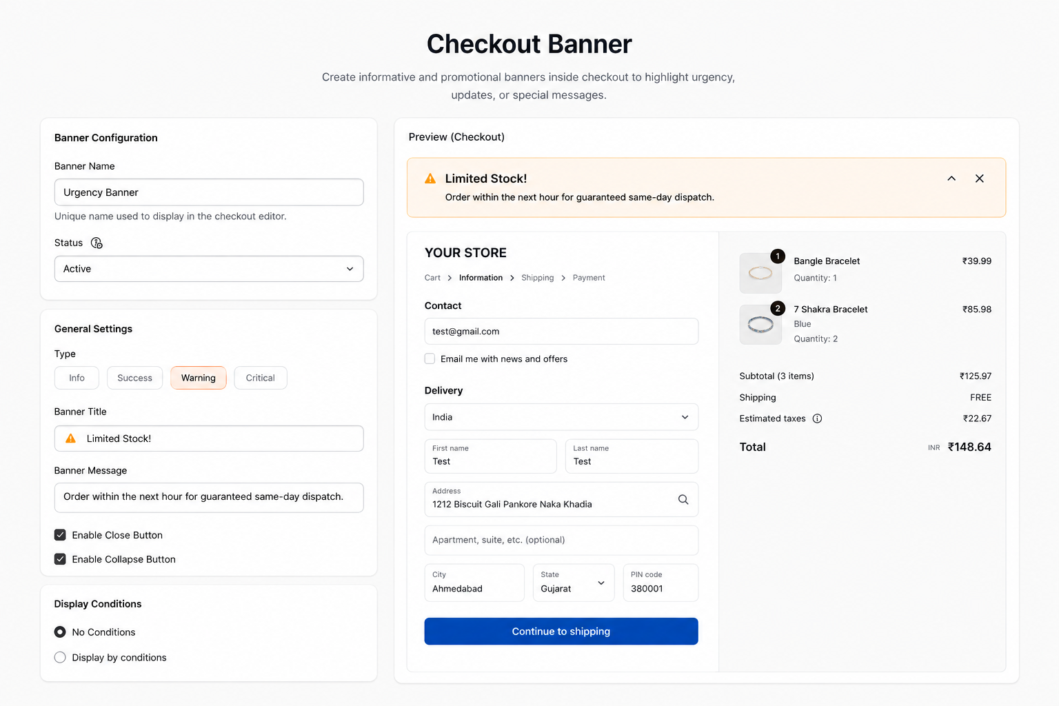
Step 1: Basic Configuration
- Enter a unique Banner Name. (Important: You will enter this exact name later in the checkout editor to display this specific banner).
- Set the Status to Active or Draft.
- Optionally, use the calendar to schedule a Start and End Date/Time.
Step 2: Headings, Text & Style
- Enter a Banner Title (e.g., "Holiday Shipping Deadlines").
- Enter the Message content.
- Choose the Style to match the intent (Info, Success, Warning, Critical).
- Optionally, enable the Close and Collapse buttons so customers can dismiss the banner.
Step 3: Set Display Conditions
- Click Set Conditions to control exactly when the banner appears.
- Example 1 (Urgency): Show a Warning "Sale ends in 1 hour!" banner ONLY on a specific date.
- Example 2 (Shipping): Show a Success "Free shipping unlocked!" banner ONLY when the cart total is greater than $100.
Step 4: Open Checkout Editor & Add Block
- Navigate to Settings → Checkout to open the checkout editor.
- In the editor, click Add block and select Custom Banner.
- Enter the exact unique Banner Name you created in Step 1. The banner will instantly load.
Step 5: Save and Verify
- Click Save in the editor.
- Preview your checkout to confirm the banner appears correctly under the right conditions.
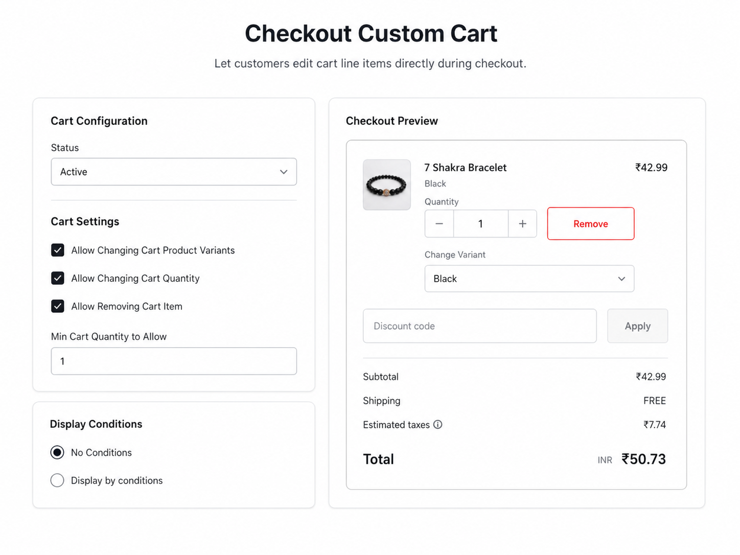
5. Custom Cart
Step 1: Basic Configuration
- Set the Status to Active or Draft.
- Optionally, use the calendar to schedule a Start and End Date/Time for when these cart rules apply.
- Note: Unlike other components, the Custom Cart acts globally, so it does not require a Name.
Step 2: Configure Cart Rules
- The main benefit: Customers no longer need to abandon checkout and go back to the cart page to make changes!
- Enable options so customers can edit items, remove items, change variants, or update quantities directly on the checkout page.
- Set a minimum cart quantity required before allowing checkout changes.
Step 3: Set Display Conditions
- Click Set Conditions to control when these cart modifications are allowed.
- Example Use Case (Flash Sale): Disable quantity editing during a flash sale. Set a condition where if the cart has the "BlackFriday" discount code applied, the custom cart block restricts changes to ensure inventory isn't oversold.
Step 4: Open Checkout Editor & Add Block
- Navigate to Settings → Checkout to open the checkout editor.
- In the editor, click Add block and select Custom Cart.
- Because there is only one global cart configuration, the block will automatically apply your rules.
Step 5: Save and Verify
- Click Save in the editor.
- Preview your checkout to confirm the cart behaves exactly as configured under your specific conditions.
6. Trust Badge
Step 1: Basic Configuration
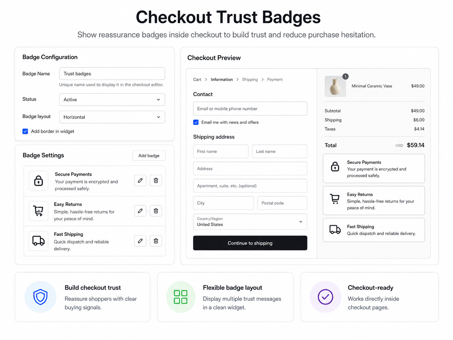
- Enter a unique Component Name. (Important: You will enter this exact name later in the checkout editor to display this block).
- Set the Status to Active or Draft.
- Optionally, use the calendar to schedule a Start and End Date/Time for when these badges should appear.
Step 2: Badge Layout & Design
- Choose a Badge Layout: Display your badges in a Horizontal row or a Vertical stack.
- Under Badge Settings, click Add badge to create one or more trust badges.
- For each badge, customize its specific text (e.g., "30-Day Money-Back Guarantee", "Secure Checkout").
Step 3: Customize Icons
- Enable Show Icon if you want an icon to display beside the text.
- Choose from built-in standard icons or upload your own Custom Image.
- You can mix and match—each badge can have its own unique text, color, and custom icon.
Step 4: Set Display Conditions
- Click Set Conditions if you only want to display these badges in specific scenarios (e.g., only for certain products).
Step 5: Open Checkout Editor & Add Block
- Navigate to Settings → Checkout to open the checkout editor.
- In the checkout editor, click Add block and select Trust Badge.
- Enter the exact unique Component Name you created in Step 1. Your customized badges will instantly load.
Step 6: Save and Verify
- Click Save in the editor.
- Preview your checkout to confirm that the badges display correctly with your chosen icons, text, and layout.
7. Payment Icons
Step 1: Basic Configuration
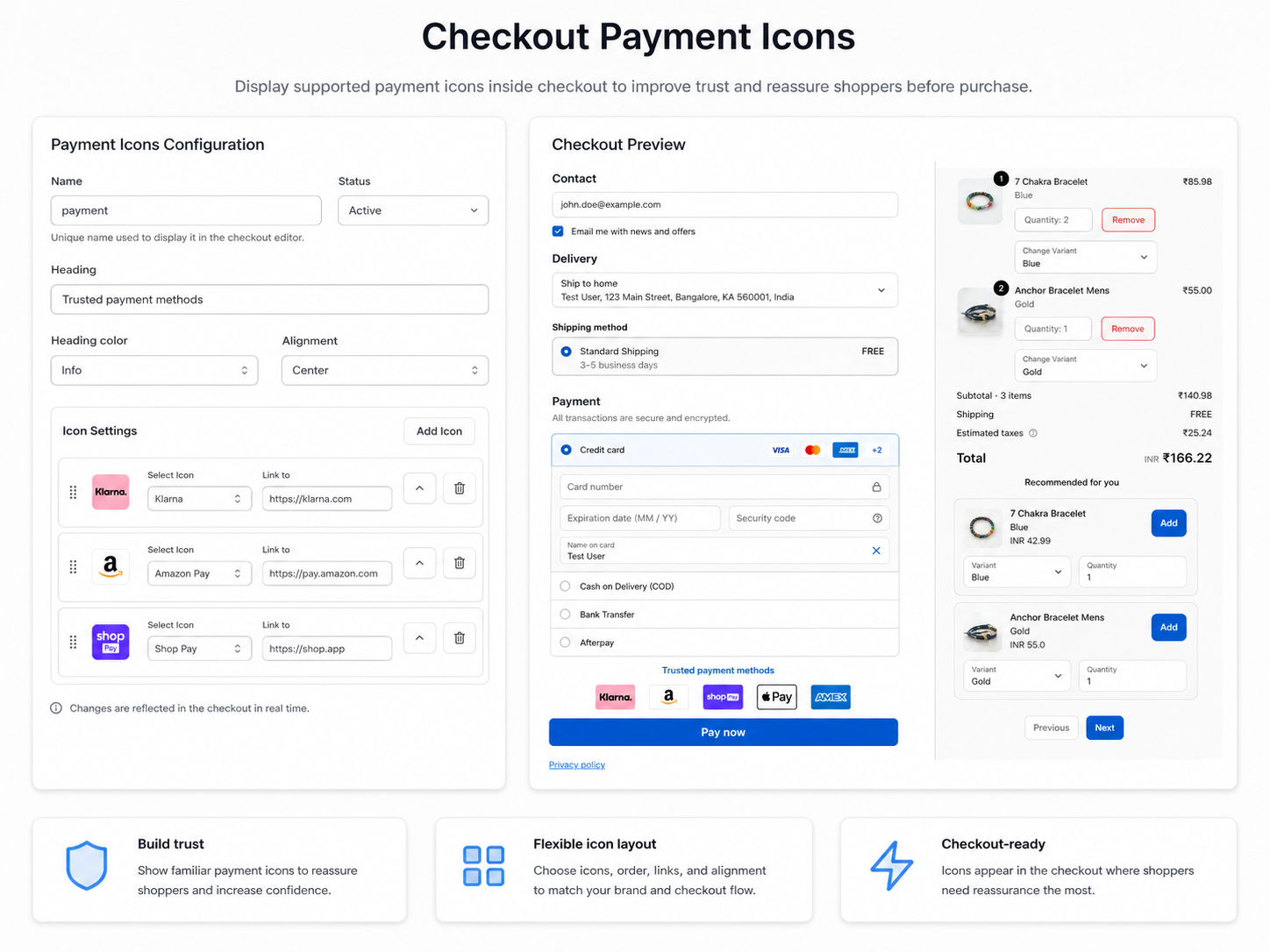
- Enter a unique Name (e.g., payment). (Important: You will enter this exact name later in the checkout editor to display this block).
- Set the Status to Active or Draft.
- Optionally, use the calendar to schedule a Start and End Date/Time.
Step 2: Headings & Alignment
- Enter a Heading for the block (e.g., "Secure Payment Options").
- Choose the Heading color (e.g., Info).
- Set the Alignment (e.g., Center) so the icons fit perfectly with your checkout design.
Step 3: Add & Configure Icons
- Under Icon Settings, click Add Icon to include a new payment option.
- For each icon, choose from the built-in Payment Icons (e.g., Klarna, Visa, PayPal) or upload your own Custom Image.
- Optionally, set a Link to URL if you want to redirect customers when they click a specific icon.
- You can add multiple icons to showcase all your accepted payment methods!
Step 4: Set Display Conditions
- Click Set Conditions if you only want to display these icons in specific scenarios (e.g., only if a certain shipping country is selected).
Step 5: Open Checkout Editor & Add Block
- Navigate to Settings → Checkout to open the checkout editor.
- In the checkout editor, click Add block and select Payment Icons.
- Enter the exact unique Name you created in Step 1. Your customized icons will instantly load.
Step 6: Save and Verify
- Click Save in the editor.
- Preview your checkout to confirm the icons appear exactly as configured.
8. Image Carousel
Step 1: Basic Configuration
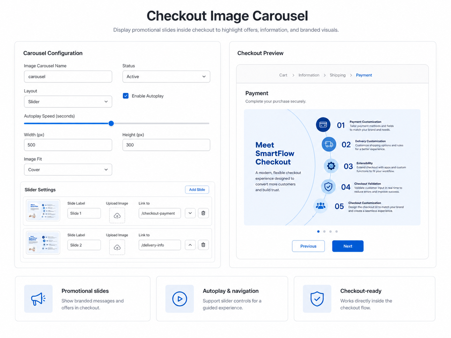
- Enter a unique Name (e.g., carousel). (Important: You will enter this exact name later in the checkout editor to display this block).
- Set the Status to Active or Draft.
- Optionally, use the calendar to schedule a Start and End Date/Time.
Step 2: Carousel Layout & Dimensions
- Choose your Layout (e.g., Slider).
- Configure dimensions by entering the Width (px) and Height (px).
- Select the Image Fit preference (e.g., Cover).
- Optionally, turn on Enable Autoplay and set the Autoplay Speed (seconds).
Step 3: Add & Configure Slides
- Under Slider Settings, click Add Slide to create new carousel slides.
- For each slide, upload your image using the Upload Image button.
- Provide a Slide Label for accessibility and identification.
- Optionally, set a Link to URL if you want the slide to redirect customers when clicked.
Step 4: Set Display Conditions
- Click Set Conditions if you only want to display this carousel in specific scenarios (e.g., only show promotional slides if the cart is over a certain amount).
Step 5: Open Checkout Editor & Add Block
- Navigate to Settings → Checkout to open the checkout editor.
- In the checkout editor, click Add block and choose Image Carousel.
- Enter the exact unique Name you created in Step 1. Your customized carousel will instantly load.
Step 6: Save and Test in Checkout
- Click Save in the checkout editor.
- Preview your checkout to confirm the carousel displays correctly.
- Test autoplay and navigation arrows for proper behavior.
Need help? Contact our support team at support@celirox.com